WIKTORIA FAŁKOWSKA
CREATIVE DESIGNER
DESIGN SYSTEM
TYPE STYLE

PANDORA REDESIGN
design system / user experience
Welcome to my UX/UI portfolio, where I present the Pandora Redesign Project—an exciting venture that harmonizes aesthetics and user-centric design for the Danish jewelry brand, Pandora. Explore the transformation journey, from revitalizing the visual identity to enhancing user interfaces. Witness the fusion of cutting-edge design and intuitive navigation, creating a digital sanctuary. Join me in unveiling Pandora's evolution—a testament to creativity, technology, and a commitment to unparalleled user experiences.
PROJECT WAS DEVELOPED AS A FINAL ASSIGNMENT DURING A DIGITAL DESIGNER COURSE.

PANDORAREDESIGN, UX/UI, PROTOTYPE
CHALLENGES
Redesign of Pandora website was a great challenge. The Danish jewelry giant has a lot to offer, the current website is very complex and has a lots of functionalities.
I did focused on the aesthetic layer. I proposed a slighty refreshed modern page layout using the brand’s content.
1.Creating a website with streamlined maintenance
2.Establishing robust UX practices, particularly for mobile platforms
3.Enhancing overall performance
4.Presenting Pandora's brand and product narrative more effectively
5.Highlighting the significance of high-quality video content
WHAT I DID?
FIRST STEP
1/. UX RESEARCH including content mock ups, visual directions based on competitive benchmarking analysis
2/. SITE MAPS
3/. USER PERSONAS
4/. USABILITY TESTING
SECOND STEP
1/. DESIGN SYSTEM
2/. DESIGN DESKTOP / DESIGN MOBILE
3/. PROTOTYPING


SITE MAP
PRIMARY COLOURS
DESIGN SYSTEM
TYPE STYLE
DISPLAY 1/95
GEOMANISTIC
LIGHT
GEOMANISTIC LIGHT
RESPONSIVE
SIZE: 95
LINE -HIGHT: 100
LETTER SPACING: -5%
DISPLAY 1/71
GEOMANISTIC
LIGHT
RESPONSIVE
SIZE: 71
LINE -HIGHT: 100
LETTER SPACING: -5%
GEOMANISTIC LIGHT
DESIGN SYSTEM
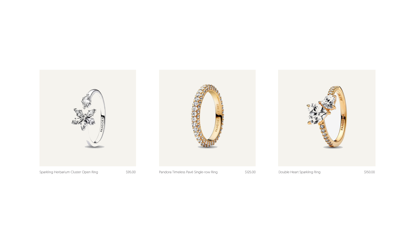
components / picture aspect ratio
.png)

PRIMARY COLORS
Brown 200/300/500/600/700


PRIMARY COLORS
Grey 200/300/500/600/700

navigation
DESIGN SYSTEM
footer
DESIGN SYSTEM


